YONKIS FLASHERA

Labels: experiments, flash, motion
LT2
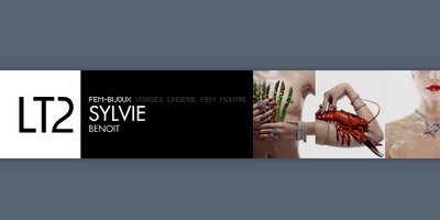
Another Flash photography website, this time of a agency. Very simple and attractive site, nothing speaks louder than the photographs itself, yet the simple and powerful way of arrangement and layout does'nt dither it from looking professional. Sweet, simple and powerful!
Labels: agency, flash, minimalistic, photographer, portfolio, simple
SAMSUNG X820
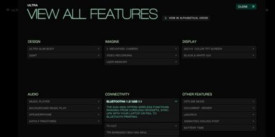
Another product promotional site and again from Samsung, its been a while since this site came out, but it really is very impressive even now. Its clear, concise and very particularly product endorsing. The colors are crisp, the font is beautiful and the layout is crafted specifically to look very product oriented. Simply worth visiting!
Labels: flash, product, promotion
TANDI PHOTO
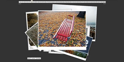
Another flash photography showcase site, of a hobbyist. The site is plain, simple and functional. The layout element of having a spreaded layer of snaps just adds to the beauty of the then viewing snap. The navigation is sweet and the added advantage of choosing a picture of choice is quite pleasant, just remember the photo number or just cruise around easily while enjoying the snaps. You might come across
this site while navigating, which is also a really sweet site!
Labels: flash, minimalistic, photographer, portfolio, simple
KREW MEDIA

Quite a different agency site in a while and the pure generic difference from most agency sites itself is a reason one might wanna visit it. The site has, what seems to be a blog kind of layout at first, but its only after the site loads completely that one can see the depth and the sharpness of the site. It does take some time to load, and some more time even after that, but its definitely worth the wait. It is'nt like a 100% flash site, nor is it a one-page-portfolio site, it manages to blend them almost well.
The beauty of the site is that its made in a way that as one glides through the page from top to bottom, your degree of wanting to contact the agency increases, and right there is the contact form. The site is crisp, the navigation is'nt a breeze, but when one hangs around - and it does manage to get that from you - its almost fine. The only other navigation bite is that every or most clicked links opens up a new window and the nature of "clickablity" would have been fun with some consistency. The detailed work showcase accompanied by a fine looking blog and the quality of the nature of work makes it quite a site!
Labels: agency, flash, motion
LEE JEANS EUROPE
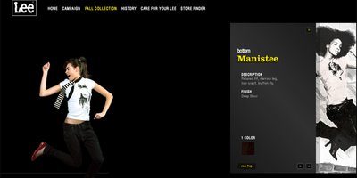
Another promotional site, this time of a jeanswear company. The site implements nice fonts and a very simple color scheme, thereby highliting the purpose of the site - focus on the clothes. The site also contains other usual jeanswear promotional site links like washing care, campaigns, store locator and ofcourse the collection. Heavy but kinda sweet!
Labels: flash, product, promotion
LUVGALZ

Luvgalz is back and the newer version looks really "sexy" in all sense of the term. The site has lovely colors and a very nice feel to it. The site has a supercool intro, and it loads into an ever cooler looking page. The site has some inspiring galleries, cool wallpapers and a very interactive, fun 'dressing-room', where you can make yourself a illustrated girl with fashion and taste of your choice and have it mailed to you, or even better print it out. Quite an inspiring site to visit!
Labels: experiments, flash, graphics
MARKO PHOTOGRAPHY
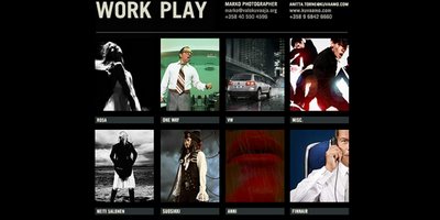
Yet another minimalistic photographers' portfolio site. This site is extremely simple, yet serves the purpose beautifully. The beauty of the site is, you can just go the site, and sit and watch the portfolio in a slide show as the photo updates automatically. Or you can click on the image to enter a well crafted layout of beautifully displayed images. The colors are perfect, the font is crisp and the navigation is a breeze. The site might not be coded in light of web modernism of code minimalism, but it sure has that hold of purpose served on a platter of delight!
Labels: minimalistic, photographer, portfolio, simple
JACOB LANGVAD

Another example of a very fine minimalistic site. Here again the site is build purely on the strength of the photographers' works. The site showcases the work beautifully and the minimalistic navigation approach does'nt encroach the strength of the photography. The only navigation hindrance is that the user is limited to choosing a photo only in a propagation manner, otherwise the site is really sweet!
Labels: flash, minimalistic, photographer, portfolio, simple
REAL GRAFFIKS
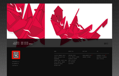
A really warm minimalistic style site. The idea of the whole site revolves around the showcasing of the portfolio work as a header, which serves the purpose of showcasing and still looks minimalastic and neat. The navigation is crisp except there could have been a active color for the link in use!
Labels: 3D, flash, graphics, minimalistic, motion, portfolio, simple, web
RM IMAGES
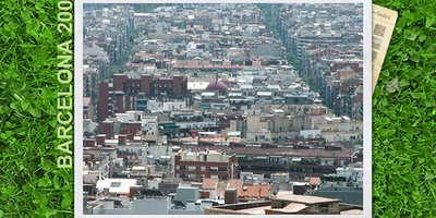
Another Flash photography site that displays the core element of the website - that being photographs - as the root theme the website is build around. The crisp grass as the background give a lively feeling, the photographs are classified beautifully, each category opens up nicely, with a comfortable display size - big enough for the detailed eye and small enough for quick loading. Quick and easy navigation adds to the sites' quality and neat visual experience!
Labels: flash, photographer, portfolio
SAMSUNG K5
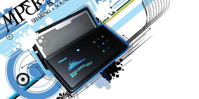
Product promotional sites are almost always Flash based these days. They have to speak volumes about the product and still manage to have a killer site. Ofcourse the product has to be something the company believes enough to be worthy of having a killer site. Often a killer site, almost kills the idea of having a killer site in the first place, for a product, not necessarily a killer one at that!
This site seems to do just that. Its a killer site, and almost better than what the product seems to be. The site has an awesome loading and implements some nice fresh summer colors, along with some modern "graphiky" elements which makes it appear quite fresh, modern and almost functional!
Labels: flash, graphics, product, promotion
VISUMMEDIA

A really neat and fantastic site. This site is an example of web modernism and pure capability. The site is extremely functional, fast and leaves an impression in terms of look and feel. There is no drama about the site, its quite simple, but the superb colors and modern web elements like the header graphics, make it quite a site!
Labels: portfolio, simple, web
MASSIP-PHOTOGRAPHE
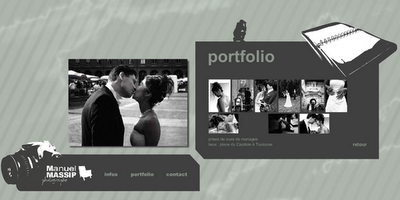
Another flash site, another photograhers' site. The site is pretty clean and neat, takes up some time to load, but that is covered up by the fact that the navigation is pretty interactive and each navigation item is preloaded. The photographs are displayed quite logically, only a bigger preview of each photograph would have been great!
Labels: flash, photographer, portfolio
JAVIER FERRER VIDAL
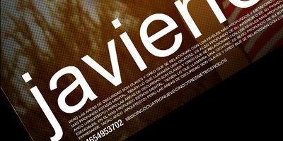
A very interesting flash site, its quite interactive and flashy without overdoing it in any way. The only thing is that you dont get an immediate feeling that it is a photographers portfolio site. But once you are in and you begin exploring the idea is'nt far off. Detailing like the color negation on photo selection as loding is very impressive!
Labels: flash, photographer, portfolio
WOULDYOULIKEAWEBSITE

Just a pure fun, good looking website. Through this website, chances are that you might get to
here. Well that could have directly been shown, but this was is bit more interesting. Very interactive, too much fun and the job of showcasing the works is easily put across!
Labels: agency, flash, motion
BLEED

Interesting little site, little because it gives the feeling of being a small site in someway, but interestingly is quite nice contentwise and quite refreshing. Not the most comfortable navigations, but the style of the site gives a very modern and we-know-what-we-are-doing feel to it. Nice works and very pleasant site for some quick inspiration!
Labels: agency, flash, graphics
ELEGALINDUS3
A neat, simple and interesting little site. The site loads quickly, showcases the works beautifully in a well arranged table kinda style. The works are also very impressive. The logo style aligns with modernity and gives the site a very updated feel. Simply nice!
Labels: graphics, portfolio, simple